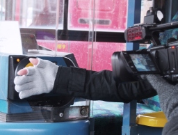
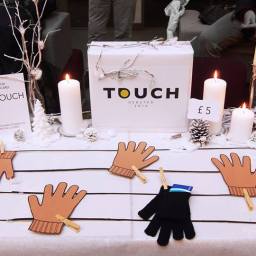
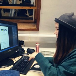
Finally our products were arrived safely! Before starting to sell our TOUCH gloves, I felt that business card and good packaging would be necessary for the successful business. As a designer in my business team, I struggled to create an excellent card and wrapping which is helpful to accentuate our products and appeal audience. From a business card and packaging, we can make a good first impression as well as express clearly our brand identity to consumers. I researched how to create a good business card and packaging and organised my ideas as following.
- Business card
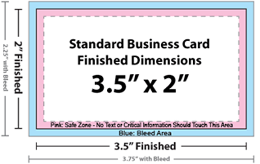
Standard business cards are 2″ x 3.5″, in either vertical or horizontal orientation. Horizontal is more conventional, but several people and companies opt for vertical layouts nowadays.
The standard dimensions for a printed business card are 3.5 x 2 inches. That’s the finished card size. Many printed designs include bleed. The “bleed area” is an extra 1/8 inch of space for design elements or backgrounds that extend beyond the finished size of your piece.
Actually any size and shape can be used for the business cards, and over-sized and under-sized cards are growing in popularity. In addition to this, folded cards are also great to give good impression.
There were many options but Joanna and I decided to follow traditional size 2″ x 3.5″ and rectangle shape. Because we needed to consider our budget which is not that enough to make something unique size and shape. Besides, we had a plan to put our business card into the pocket on the glove when we pack goods. In order to this, we realised that card shape should be a rectangular with dull edges. Also, the card should be made a vertical orientation considering our pocket direction, so consumer would look at our business card naturally and straightforward.
When creating design file for your business card in vertical orientation, use these tips: If you’re designing a vertical card with the long size up, simply switch the page width and height so you won’t have to rotate the card to see the design the way you intend it.
I thought that colour is one of the most important factors in business card, since we can establish product identify through colour. I tried to connect and unify all elements such as display, packaging, website, business card, company logo, glove logo etc. into one style with our product: TOUCH gloves.
Colour choices can have a great impact on the type of printing process we can use, as well as the cost of printed piece.
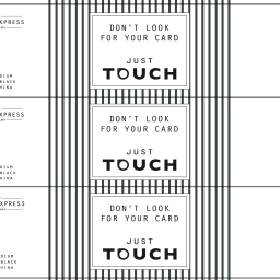
Since our website(facebook/twitter/instagram) and general style are minimalist, stick with a minimalist card. So it is necessary to pay close attention to typefaces and colour and less attention to images and embellishments. With a minimalist design, we might consider using a more expensive printing technique like letterpress or engraving, because we are only using two colours in card. But I determined to print with standard machine in the uni to save money.
— Inspiration
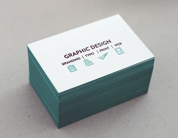
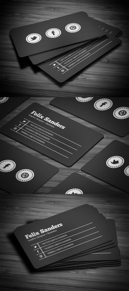
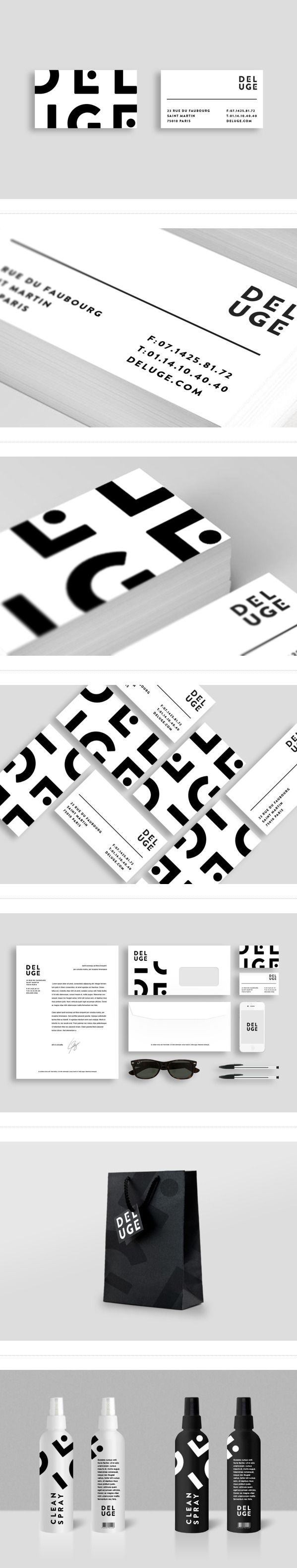
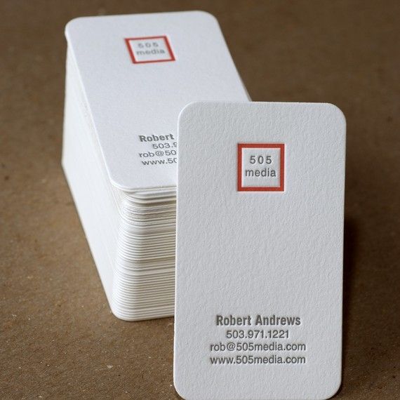
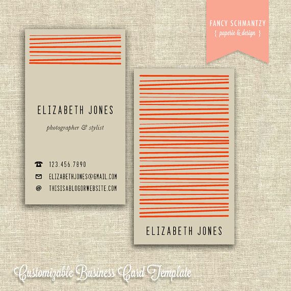
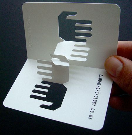
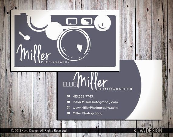
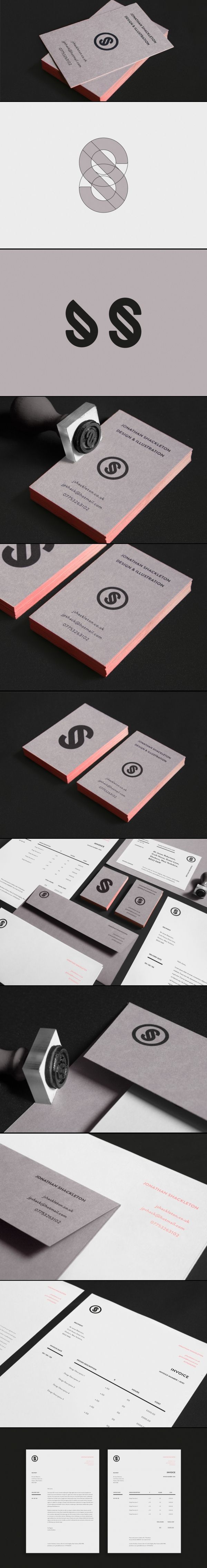
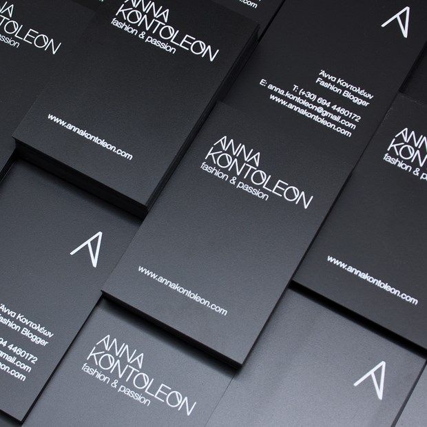
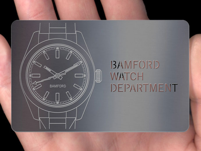
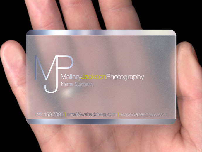
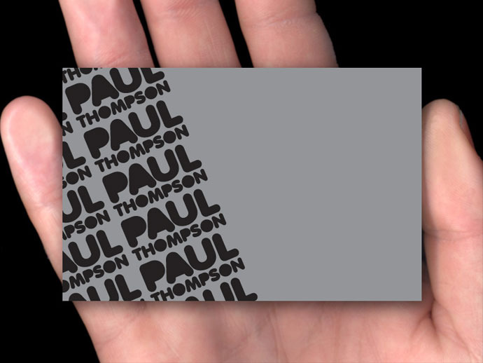
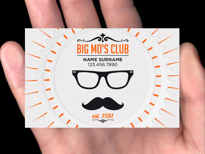
Below are several examples of excellent business card designs to inspire me and give some ideas for business card designs.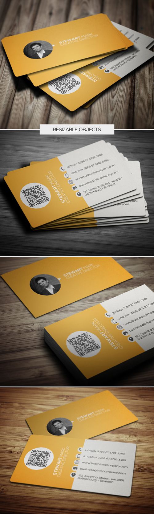
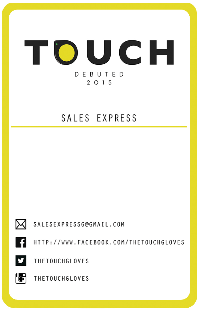
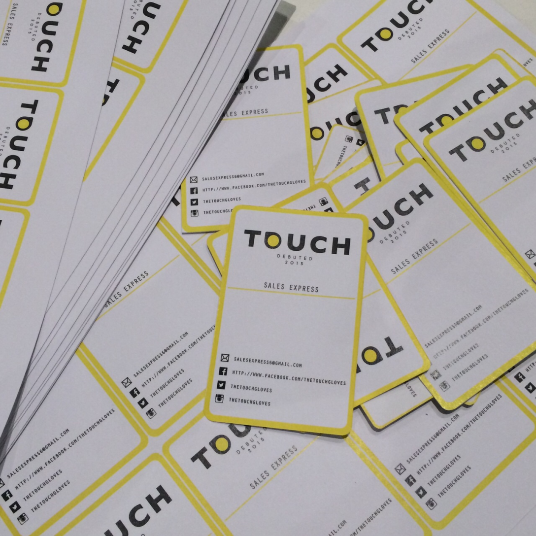
Regarding typeface, I just used font named “Orator Std” which is simple, clean and similar with gloves logo letter. And card was made up of three colours; black, white and vivid yellow. As a point colour, yellow was used very small parts, the edge side and inside letter O. Below image is my outcome!
There are many different materials for business card. We can make creative and outstanding card using lots of special materials.
– Metal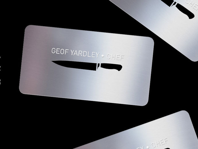
– Plastic
– Standard
– Letterpress
Except for these, there are also specialty materials using embossing, embellishments etc.
There are a variety of printing methods out there. There are also a wide variety in the quality, look, and cost of the different printing processes. Card quality will be decide according to the printing methods, Joanna and I discussed about this, we thought that digital printing method is suitable for ours. Digital printing methods are probably the most common ways to have business cards printed. Among digital printers, some use inkjet technology while most others use laser printers. We will only produce small quantities so digital press would be good for us, it is more cost-effective way compare to others, like engraving.
Business card’s primary objective is for prospective and current clients to be able to access your contact information. The information we provide on the card is vital to how effective it will be.
For easy contact with clients and advertise our product, I chose fundamental contents and put in the basic contact information as below.
- Glove logo (our brand simple)
- Company name
- Email address
- Facebook page address
- Twitter username
- Instagram username
Final outcome :

Design is an opportunity to continue telling the story, not just to sum everything up.
– Tate Linden
Continue reading “:: Designing a Business Card ::”
51.507351
-0.127758